


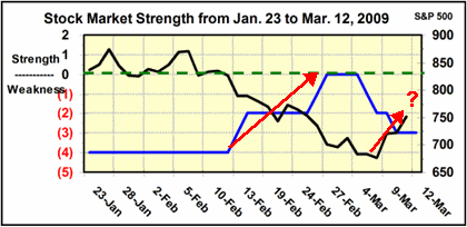
I don't usually post these charts in public, but this is from Fred's recent TSP report. The market strength chart has always been so intriguing to me but it is not as easy to use as it might look at times.
The strength chart (blue line) can lead the market (black line) by one to two weeks, but can be a lot less during a volatile market.
Fred showed this current rally on the chart a few weeks ago but asking him about it, he said that since it never made it above -0-, that it is not a measure of coming strength, just weakness subsiding. Well, that turned out to be an understatement and I did not take advantage of the rally.
Now we see that, in the area of weakness (below -0-) the strength line is moving right back down. I would think that would start sometime next week, although the blue line did move higher for two weeks before peaking, and this rally is only one week long.

 Reply With Quote


")


